If you are a freelancer, your business image depends not only on the job, but also on your personal qualities. In every project that you have ever performed, there are your views on the design , these projects are embedded particles of your soul and your personality. In the commissioned work is a reflection of your worldview.
If you are dealing with freelancing, you should pay attention to your brand name or brand, which will reflect the uniqueness of your company. Although all the design elements of your brand sales must be carefully chosen, one of the most important elements, nevertheless, will be the colors that you choose. Here are six tips on how best to find the right color for your business.
Start with the questions

Before we dive into the process of choosing colors, you might want to ask yourself the following questions:
What are the colors I was really attracted to?
Are there certain colors that are most suitable for the expression of my ideas?
What colors do I avoid?
What customers need to know about my business?
What is the purpose of this whole undertaking?
By asking these questions, you can begin to narrow the list of colors, leaving those that are most suitable for processing of your brand. Usually, people instinctively choose the appropriate color, and you also must start all at once obtained.
Be aware of their competitive


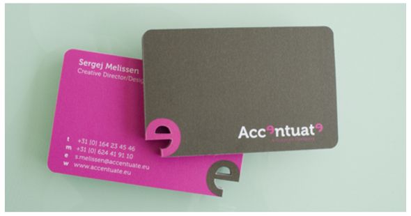
In the world of freelancing is very difficult to understand how competitive you are, because the market boundaries are blurred. However, if your freelance work is concentrated in one community, compare themselves with other freelancers in this community. Unfortunate decision to try to make your business image in exactly the same as the image of your fellow competitors, who have achieved more than you do. We must try to avoid this and to find their own solution. But, but, if you really admire someone's freelance work, will be useful to look for examples of such design work. Very often the best solution is to study works of the most successful freelancers, but not to blindly follow their example, and to discern in them some elements of successful and use them. Depicted in the photographs above cards companies Accentuate and Magics Friends - visual confirmation of the effectiveness of combining good design and matching colors.
Find out what the color says
Each color makes some people feel certain. Therefore, you should try to pick the colors that will not cause negative emotions in your potential clients. For example, such colors as orange and red colors are considered risk because they are associated with anger and passion.
Many online services offer to learn how we associate colors with words. Cymbolism - one of these services. There you can vote for the color and the phrase, as well as look for other opinions on this matter.

Pay attention to cultural differences
If you are a freelancer who works with international clients, we can use in their work a certain color, you should pay attention to the difference of perception of different nations and colors on the color symbolism in different cultures. For example, if a white Western culture - a symbol of peace and hope, it does not mean that other cultures will perceive it as well. There are many online resources that help to avoid errors due to ignorance of freelancers working in the international market, the subtleties of other cultures.
Mix colors

When choosing your color, you should not be limited to only one approach. Instead, create a full palette of colors suitable to you. Creating, you can see the best way to solve this problem - the problem of implementing the most appropriate colors to your growing business image.
However, if you are using a variety of colors for your logo, exercise caution. Certain colors, which each by itself is suitable for your business image may not be combined with each other and together lead to a negative result.

Before we dive into the process of choosing colors, you might want to ask yourself the following questions:
What are the colors I was really attracted to?
Are there certain colors that are most suitable for the expression of my ideas?
What colors do I avoid?
What customers need to know about my business?
What is the purpose of this whole undertaking?
By asking these questions, you can begin to narrow the list of colors, leaving those that are most suitable for processing of your brand. Usually, people instinctively choose the appropriate color, and you also must start all at once obtained.
Be aware of their competitive


In the world of freelancing is very difficult to understand how competitive you are, because the market boundaries are blurred. However, if your freelance work is concentrated in one community, compare themselves with other freelancers in this community. Unfortunate decision to try to make your business image in exactly the same as the image of your fellow competitors, who have achieved more than you do. We must try to avoid this and to find their own solution. But, but, if you really admire someone's freelance work, will be useful to look for examples of such design work. Very often the best solution is to study works of the most successful freelancers, but not to blindly follow their example, and to discern in them some elements of successful and use them. Depicted in the photographs above cards companies Accentuate and Magics Friends - visual confirmation of the effectiveness of combining good design and matching colors.
Find out what the color says
Each color makes some people feel certain. Therefore, you should try to pick the colors that will not cause negative emotions in your potential clients. For example, such colors as orange and red colors are considered risk because they are associated with anger and passion.
Many online services offer to learn how we associate colors with words. Cymbolism - one of these services. There you can vote for the color and the phrase, as well as look for other opinions on this matter.

Pay attention to cultural differences
If you are a freelancer who works with international clients, we can use in their work a certain color, you should pay attention to the difference of perception of different nations and colors on the color symbolism in different cultures. For example, if a white Western culture - a symbol of peace and hope, it does not mean that other cultures will perceive it as well. There are many online resources that help to avoid errors due to ignorance of freelancers working in the international market, the subtleties of other cultures.
Mix colors

When choosing your color, you should not be limited to only one approach. Instead, create a full palette of colors suitable to you. Creating, you can see the best way to solve this problem - the problem of implementing the most appropriate colors to your growing business image.
However, if you are using a variety of colors for your logo, exercise caution. Certain colors, which each by itself is suitable for your business image may not be combined with each other and together lead to a negative result.
Check your choice of colors

As a responsible freelancer, you probably have never sent to the client work, without having to first check it is not. So your brand - it should not be formalized or print business cards until you have selected the color will not pass inspection.
Send your creation to friends and fellow freelancers, so they rated it professionally. If the reviews are definitely good, we can assume that you already have your own brand. But if there are good and bad reviews about the same ratio, be prepared to revise the palette of your brand.
By testing a variety of colors, pay special attention to how these colors and their combinations are perceived by people with visual impairments. You should take note that, for example, color-blind see colors does not like other people.
Correct colors - is the foundation of any good design. He stirs positive emotions in people and leading them to the necessary action. You can achieve a lot in my freelance work when creating a brand that will take into account the range of colors. Properly selecting the colors, you create a unique image that will be fully disclosed to you and your work in this way, what you want.
Your Turn
And what colors you choose for your freelance web site and why you chose them?
source: wbupdates.com/2012/03/how-to-choose-color-for-your-personal.html


0 comments:
Post a Comment