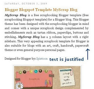
Top 10 Productivity Applications of 2011

Top 10 Productivity Applications of 2011

motion 5: Getting Around in Motion

motion 5: Getting Around in Motion

Target your Audience by Designing

Target your Audience by Designing

WDD wishes you a very Happy New Year!

WDD wishes you a very Happy New Year!
Showing posts with label Css. Show all posts

How To Fix The Blogger Post Paragraph With CSS Justify


Cinder Cone, Kapoho Eruption, HawaiiAfter align justify
Cinder Cone, Kapoho Eruption, Hawaii
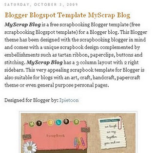
Before align justify


Although blogging has been widely known since ever, many features on the pages are still unknown. Bloggers often ask questions about how to customize the appearance of many features inside their Blogger templates (Blogspot templates). There are many custom Blogger templates available to download to change or enhance the appearance of the pages instantly. However, simple CSS styling tricks and tips can also bring good customization to some features on the blog. A little learning of CSS can enrich your skills and beautify the appearance of the blogs. Therefore, before you decide to download the ready-to-use templates, it is good to try customizing the existing ones.

The tutorial provided below is only a part of a series of articles discussing about tricks to customize Blogger templates using CSS styling. The explanations are provided as comprehensive as possible allowing beginners and newbie to understand the simple steps. Keep on reading to know some good and easy procedures to enhance the appearance of your Blogger templates.

Justifying Blogger Posts (Blogspot Posts) Using CSS

The default settings only allow you to choose one from two text alignments, which are left and right. Either way, your texts will be aligned to one side while the other side is ragged. Actually, it is easy to change this to justified alignment. CSS styling section of the Blogger template brings the options to add another line to the text. It is the secret to create justified alignment to the Blogger templates.

There is also another way to change this alignment setting. As shown in MS word and many other word processing programs, justified alignment means that the text will be stretched from the center. Therefore, each of the edges of the text (left and right) will be in a straight line from up to bottom. Such appearance is common in newspapers and magazines. Although it sounds like a real simple feature and option, you can see that there will be huge differences in the overall designs of the page. Smart Bloggers aware of this feature and most of them choose to make a justified alignment for better Blogspot posts. The following explanations will list systematic procedures to create a justified alignment to the Blogspot templates.


  1. Before you begin any customization, please make sure that the text is not already in justified alignment. The following procedures can only be done if the text is left aligned. If it is already in justified alignment, you will not need to follow the next steps
  2. Make sure you are logged in
  3. From the Dashboard, click the Layout link for your blog and choose Edit HTML
  4. In order to avoid any mistake, please back up your template by downloading it in a full
  5. Press CTRL + F to find a code block beginning with .post in the CSS styling section of Blogger template. Most code blocks are made in typical format. Although there is a great diversity in templates, the code blocks are mostly the same. Example:

.post {
margin:.5em 0 1.5em;
border-bottom:1px dotted $bordercolor;
padding-bottom:1.5em;
}


  1. Add the following line and it will turn like this:
.post {
margin:.5em 0 1.5em;
border-bottom:1px dotted $bordercolor;
padding-bottom:1.5em;
text-align:justify;
}

  1. Click on Save Template
  2. Click View Blog to see the alignment of all your posts has now changed to justified
Tips and Troubleshooting

If the Blogger template is already aligned in justified order, you can also change/align it left. Repeat the above procedures, find the code block and modify it. Add the following code:

text-align:left;

The new code block will be:
.post {
margin:.5em 0 1.5em;
border-bottom:1px dotted $bordercolor;
padding-bottom:1.5em;
text-align:left;
}
Anytime you need to make it right-aligned, simply replaces the word ‘left’ with ‘right’.

The entire steps provided above only take approximately a minute. They are easy, simple and useful to enhance the appearance of your blog.

Making a Web Form Print-Ready

 You need to have a form that users can fill out online, or that they can print and then
fill out offline, as shown above.


Solution
First, create a print media stylesheet and a class selector that transforms the form elements
so that they display black text and feature a 1-pixel border on the bottom.
For example, consider the following HTML code for an input text element:
To style the form element requires the following CSS rule:

<style type="text/css" media="print ">
.fillout {
color: black;
border-width: 0;
border: 1px solid #000;
width: 300pt;
}
</style>
For drop-down menus, hide the select element altogether and add some additional
markup to help produce the bottom border:

<label for="bitem">Breakfast Item</label>
<select name="bitem" size="1">
<option selected="selected">Select</option>
<option>Milk</option>
<option>Eggs</option>
<option>Orange Juice</option>
<option>Newspaper</option>
</select><span class="postselect"> </span>
Then, in the CSS rules, convert the inline span element to a block element. This enables
you to set the width of the span element and places the border at the bottom to equal
that of the input elements in the preceding CSS rule:

<style type="text/css" media="print">
select {
display: none;
}
.postselect {
display: block;
width: 300pt;
height: 1em;
border: none;
border-bottom: 1px solid #000;
}
</style>
For elements such as a Submit button, which can’t be used on the printed page, set the
display property to none. You can see the finished product in the picture below.


Discussion
Lines created in the print stylesheet on an order form tell users they can fill out the form
fields. By using the border property, you can easily create these lines in a browser,
making web forms useful both online and offline.
For select elements, the workaround is somewhat of a hack that involves interfering
with the ideal semantic markup; it still works and is valid HTML. Place a span element
after the select element:
<select name="bitem" size="1">
<option selected="selected">Select</option>
<option>Milk</option>
<option>Eggs</option>
<option>Orange Juice</option>
<option>Newspaper</option>
</select>
<span class="postselect"> </span>
Then set the select element to disappear:
select {
display: none;
}
selecdisplay: none; }
Next, set the span element to display as a block to enable the width and height properties.
With those width and height properties set, you can place the bottom border to
match the rest of the form elements:
.postselect {
display: block;
width: 300pt;
height: 1em;
border: none;
border-bottom: 1px solid #000;
}
Using attribute selectors to differentiate form elements
Attribute selectors from the CSS specification make it easier to style forms for print.
When you use attribute selectors, it’s easier to distinguish which form elements should
be stylized than it is when you insert class attributes and their respective values in the
markup.
In the following code, the first CSS rule applies only to input elements for text, whereas
the second rule hides the Submit button and the Select drop-down box:
input[type="text"] {
color: black;
border-width: 0;
border: 1px solid #000;
}
input[type="submit"], select {
display: none;
}
The good news is that most modern browsers now support attribute
selectors; however, Internet Explorer 6 does not.


Adding user friendliness
Since the form is now being printed, site visitors cannot use the Submit button to
transmit their information. Be sure to provide the next steps users should follow after
they have completed the printed form.
For example, if you want users to mail the form, add a mailing address to the page on
which the form is printed, as shown in the following code:
<div id="print">
<p>Please mail the form to the following address:</p>
<address class="adr">
<span class="org">
<span class="organization-name">The White House</span>
</span><br />
<span class="street-address work postal">1600 Pennsylvania Avenue NW
</span><br />
<span class="locality">Washington, DC</span>
<span class="postal-code">20500</span><br />
<span class="country-name">USA</span>
</address>
</div>
Notice that the instructions are wrapped with a div element where the class attribute’s
value is set to print. In the stylesheet for screen delivery, set the display property for
this specific class to none:
<style type="text/css" media="screen">
.print {
display: none;
}
</style
>With a separate stylesheet for print delivery, allow the instructions to be printed by
setting the display property to block:
<style type="text/css" media="print">
.print {
display: block;
}
</style>
Enjoy, please commments


See Also
Attribute selector documentation in the W3C specification at http://www.w3.org/TR/CSS21/selector.html #attribute-selectors; the HTML   specification for the label tag
at http://www.w3.org/TR/html401/interact/forms.html#edef-LABEL

Solution: Understanding the Sort Order Within CSS


Problem: You want toYou want to know how a browser handles the application of CSS rules.
Solution
The basic rule of thumb is “any CSS rule that is closest to the content wins” over any
other CSS rule.
Discussion
With so many ways CSS can be associated to a web document (see Recipe 2.12), there
needs to be a way for the browser to handle potential conflicts if the same or a similar
rule appears from two different sources.
Follow this guideline when trying to determine how to resolve conflicts within your
CSS rules:

• The user’s own styles take priority over browser styles.
• The author’s (your) styles take priority over user styles.
• Embedded styles take priority over linked or imported styles.
• Inline styles take priority over embedded, linked, or imported styles.

For example, say we have a series of paragraphs, all set to a sans serif font, as shown
in Above picture:
p {
font-family: "Gill Sans", Trebuchet, Calibri, sans-serif;
}

But when we bring in another rule to style the paragraphs with a serif font and place
this new rule before the previous rule, as shown in the following code, the paragraphs
remain unchanged:

Only when we place the serif font rule for the paragraphs after the sans serif font rule
does the change in the browser take place, as shown below.


p {
font-family: Garamond, "Hoefler Text", "Times New Roman", Times, serif;
}
p {
font-family: "Gill Sans", Trebuchet, Calibri, sans-serif;
}


Again, this occurrence follows the rule of thumb that “any CSS rule that is closest to
the content wins.”
However, there is an exception to this rule—Clarifying Specificity


Problem
You want to understand how potential conflicts within CSS are resolved, if origin and
sorting order for a CSS rule are the same.
Solution
Each CSS rule carries information that lets the browser (and us) know its weight or
specificity.
Consider the following three CSS rules:
#header p.big {
font-family: Impact, Haettenschweiler, "Arial Narrow Bold", sans-serif;
}
p.big {
font-family: Futura, "Century Gothic", AppleGothic, sans-serif;
}
p {
font-family: "Gill Sans", Trebuchet, Calibri, sans-serif;


The higher the specificity a CSS rule possesses, the greater the chance that the CSS rule
will win out over another rule. However, when viewed in the browser, the first CSS rule
(with the Impact font) wins out, as shown below


To determine why the first rule wins, determine the CSS rule’s specificity. Follow
Table when trying to determine a CSS rule’s specificity.

Selector example Inline style Number of ID selectors Number of class selectors Number of elements
p                             0                             0                      0                                  1

p.big                       0                              0                      1                                  1

#header p.big         0                                1                  1                                    1


According to Table
• The p selector has a specificity value of 0,0,0,1.
• The p.big selector has a specificity value of 0,0,1,1 because of the class selector.


• The #header p.big selector has a specificity value of 0,1,1,1 because of the class
and ID selectors.
In these examples, the last selector has a greater specificity, and therefore wins in a
conflict.


Discussion
The origin and sorting order of CSS help a browser to determine which rules win out
over others (and the !important declaration allows certain rules to override others).
When those methods of determining which CSS rules should win fail, there is a conflict.
CSS has in place a way to deal with those conflicts: the specificity of the CSS rule
itself.

The higher the specificity of a CSS rule, the greater the likelihood that the CSS wins.


Several CSS specificity calculators are available online to help you determine the specificity
of rules. One such calculator is available at http://www.suzyit.com/tools/specific
ity.php.